Making your component truly reusable
In the last chapter, we successfully built your first GUI component and put it on to the root canvas. As we saw, this allows you to test your component in isolation, which is a great benefit, especially when working on large scale projects. The second motivation to use components is reusability. Let’s think about this a bit more: currently our bell component is tailored to ring a bell. This somehow limits the reuse of the component. Of course you can put two or more instances of the bell component on the root canvas, but it’s unlikely that anyone wants to have two ore more buttons on the screen performing exactly the same action: ringing a bell. In a real world application you often have several buttons, which all do perform different actions, however. With the components in its current form, implementing this is not possible right now. So let’s extend the component and make it truly reusable in the next chapter!
Extending your component with properties
Let’s have a look at our component first:
-
Open the the Application unit by clicking on the tab labelled Application. If this tab is not present yet, click on the
 Project tab and double click on the Application unit to invoke the tab.
 -
We want to refactor the BellComponent in order to facilitate reuse of the component. This should be reflected in the name of the component, so go ahead and rename the component to PushButtonComponent using the F2 key.
-
Double click on the renamed PushButtonComponent element. Its contents will be show in a new tab titled with the class name Application::PushButtonComponent.
Let us reflect on the current design of the component a bit: currently there are three items hard-coded, which severely limits the reusability of this component:
-
the text shown in the header text view (hard-coded value: Bell),
-
the text of the label on the push button (hard-coded value: Ring) and
-
the slot method attached to the property OnActivate of the push button (hard-coded value: RingTheBellSlot).
In order to allow reuse, we have to extend the component so that the three items listed above can be stored inside the component. That’s what properties are made for. If you do have a Java or C# background, you already should be familiar with the concept of properties:
-
Properties are a kind of variable where data of an arbitrary Chora data type can be stored (e.g. string, int, slot, …). For each property, you have to specify the data type it can held (including its default value).
-
A property represents a more sophisticated variable in that sense that a property does have OnSet and OnGet methods that are used to get and set the value of the property. Normally, these methods contain boilerplate code that set or gets the internal memory of the property. You are encouraged to add your custom code to these method(s) to tailor them to your needs. We will do some shortly, so hold on!
-
You are allowed to attach slot methods as observer to any property we implement. As soon as the value of the property changes, the slot method (= observer) gets notified about the change. This is a core feature of Chora that allows the development of applications following the MVC pattern. We may talk about this later on.
-
Properties cannot only store arbitrary data type, they can also store references to any data type. Properties that store references are so called outlet properties. This is an advanced concept, we may talk about that later on.
That’s the theory behind property in short, let’s start and put theory into practice:
First we have to make a few adjustments to our components in order to reflect the refactoring of the component:
-
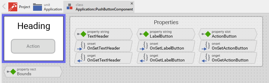
In the PushButtonComponent tab, rename the existing push button PushButtonBell to PushButton . Change the value of the property Label of this component from "Ring" to "Action".
-
Afterwards, rename the header text element HeadingBell to Header and change the value of the property Label of this component from "Ring" to "Action".
-
Delete both the existing slot method RingTheBellSlot and the corresponding note group Slot method(s) using the Del key. When using the refactored component, slot methods will be added on the root application level and not at the component level any more.
-
Remove the current value RingTheBellSLot from the the property OnActivate of the PushButton, otherwise you will run in trouble later on. To do so, select the PushButton component and right click on its property OnActivate. From the context menu select the menu item Restore default value (Ctrl+R), and the current entry will be replace with the default null value.
Let’s get our feet wet and add some properties to our component:
-
From the gallery templates window (Alt+1) with folder Chora opened (key C), drag an instance of the
 Annotation Group to the component’s canvas. Place the element right to the component’s canvas and rename the property Caption of the element to Properties using the inspector window.
 -
Now we are ready to insert our properties: Click on the element
 Property, and drag an instance over to the component’s canvas. Place the element inside the note rectangle you inserted and adapted in the previous step.
As you can see, a property named Property was inserted, together with its OnSet and OnGet methods:
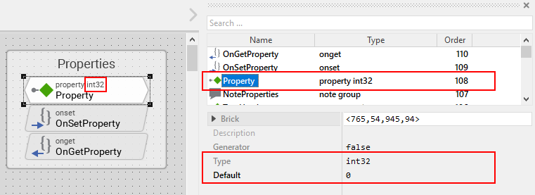
Let’s move on and adapt the property to our needs:
-
The property will be used to store the text of the header element of our component, therefore we rename the property to TextHeader using the F2. Please note that the names of the OnSet and OnGet methods automatically change to OnSetTextHeader and OnGetTextHeader respectively.
-
Currently, the data type of the property is int32, that’s not what we want, instead we want to store a string value (= the header text) inside the property. To be able to do so, we change the value of the property Type to string inside the inspector window.
-
The header text of our component should be Header by default, so we change the value Default to "Header" inside the inspector window. Don’t forget the surrounding double quotes here or you may run in trouble.
The property is now set up to store the header text value. Currently, when setting the header text property, the change of the property value is not reflected inside the component. To overcome this, we have to add some code to the OnSet method which is called each time a new value is assigned to the property.
-
Double click on the method OnSetTextHeader of the property. In the code editor window, you will now see some lines of boilerplate Chora code:
// The value doesn't change - nothing to do.
if ( pure Property == value )
  return;

// Remember the property's new value.
pure Property = value;

// TO DO:
//
// Now you can handle the alternation of the property.
Replace the TO DO: section at the bottom with two lines of custom code:
// The value doesn't change - nothing to do.
if ( pure Property == value )
  return;

// Remember the property's new value.
pure Property = value;

// change the text of the header
Heading.String = value;
Our new line of code assigns the property String of the Heading element (Heading.String) the new value the property was set to, this is immediately reflected in the GUI. That’s all we have to do! Now, as soon as the property gets a new value assigned, the header text changes, too.
The first property is ready to go, so add two more properties:
-
From the gallery templates window drag another
Property to the component’s canvas. -
Rename the property to LabelButton using the F2 key.
-
Change the type of the property to string, with a default value "Label".
-
In the body of the OnSetLabelButton method, replace the TO DO: section with the code line
PushButton.Label = value;.
This way, any change of the property LabelButton will immediately change the label text of the button. So far so good. Now we have to take care that not only the label and heading text can be set, but also the action performed once the button is clicked:
-
From the gallery templates window drag another
Property to the component’s canvas. -
Rename the property to ActionButton using the F2 key.
-
Change the type of the property to slot, with a default value null.
-
In the body of the OnSetActionButton method, replace the TO DO: section with the code line
PushButton.OnActivate = value;.
The refactoring of our component is done, it should now look like this:
Adapt and fix the main application
Now that refactoring our component is done, we have to make some changes in the main application to make the application work again:
-
Bring up the contents of the main application in the tab Application::TutorialApplication.
-
The refactored pushbutton component now shows Header as header text and Label as button label. These are the default values of the properties we just introduced to the component. Let’s customize the component’s properties, that’s why we introduced them in our component:
-
Using the inspector window, change the property of the push button component TextHeader text to Bell.
-
Using the inspector window, change the property LabelButton text to Ring.
The appearance of our component now again looks as wanted. When pressing the button, nothing happens yet. Let’s fix that, too:
-
From the gallery templates window to the left, drag an element
Annotation Group, over to root canvas. Rename the group to Slot method(s). -
Add a new slot method inside the note rectangle. Rename the slot method to RingTheBellSlot.
-
Fill the body of the slot method with the code line
trace "Sorry, the GUI cannot ring the bell!";. -
Using the inspector window, change the property ActionButton of the bell push button component to the newly created RingTheBellSlot.
That’s it! Test the main application in the prototyper (Ctrl+F5), and the main app should behave exactly as prior to the refactoring.
Adding a second component (weather forecast)
If you are asking yourself why we did the refactoring, things are getting clear hopefully as soon as we insert a second instance of the component. The GUI allows ringing the bell of your device already. Imagine your device is able to present the weather forecast to you. Maybe your device has a screen display for that purpose, or it has a speaker to read out the forecast loud. Let’s extend the GUI with a second push button component for presenting the weather forecast to you:
-
Press Alt+2 to select the gallery browser window, left to the main composer window. Alternatively, you may mouse click at the second tab Browser at the very top of the window.
-
In the search field immediately below the two tabs, type in Push to shorten the class list.
-
Click on the
 Application::PushButtonComponent class and drag a second instance of the class over to the root canvas. Rearrange the two push button components so that both of them fit on the screen.
Yeah! You successfully included a second push button component into the main app. Let’s move on and customize the newly inserted component!
-
If not already select, select the newly inserted component first:
-
Using the inspector window, change the property TextHeader of the new push button component to the text string "Forecast".
-
Using the inspector window, change the property LabelButton of the same component to "Show".
-
Add a new slot method inside the note rectangle titled Slot methods. Rename the slot method to ForecastSlot.
-
Fill the body of the slot method with the code line
trace "Sorry, but the GUI cannot tell the weather forecast";. -
Using the inspector window, change the property ActionButton of the new push button component to the newly created ForecastSlot.
The extended version of the application with two push button components should now look like in Figure 3 below:
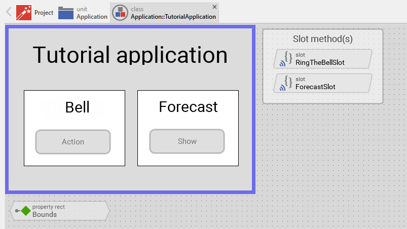
Go ahead and test your application! You should see different debugging output depending on the button pressed.
This chapter has come to an end, time to recap: By adding three properties to our component we managed to create a truly reusable component. Creating reusable components comes has its price, however, this will certainly pay off once your project grows over time.
Let’s move on to the next chapter, there’s still much more to explore!