Adding your first GUI component
In the last chapter, we successfully built the Hello world application. In order to show the text, we placed a text view element directly on the root canvas. While this is a valid approach, it is highly recommended to build reusable components and use these components when assembling your application. This approach has two main benefits:
- Testing
-
Using the built-in protoyper, you can test the components in isolation. There is a much higher chance the application works as expected once you assemble it from already tested (sub-)components.
- Reusability
-
When using components, it’s much easier to follow the DRY principle (don’t repeat yourself). You only write a component once and may use it in several places.
So let’s start and build our first GUI component: it’s a simple graphical unit with a border, a header text, a push button, and a background. Once the button is pressed, some action will occur.
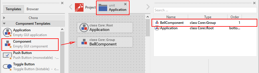
Adding the empty component itself
-
We want to place the component in the Application unit, so click on the tab labelled Application. If this tab is not present yet, click on the
 Project tab and double click on the Application unit to invoke the tab. Inside the composer window, you will now see the Application root component, the only component currently present.
 -
Press Alt+1 to put the focus on the gallery templates window, left to the main composer window. Alternatively, you may mouse click at the tab Templates at the very top of the window, to the left.
-
Press C twice: the first key press opens the Chora folder, the second key press will then open the invoke folder Component templates, that’s what we need. Alternatively, you may mouse click on the header titled Component templates inside the main area of the templates window. This will also open the folder and show all available GUI templates.
-
Identify the item
 Component, representing an empty GUI component. Click on the element, drag it into the main area and place it underneath the existing Application root component.
 -
We want to use the new component to ring a bell, so we give it a dedicated name: with the component still selected, press F2 to rename the component. In the inspector window, type in BellComponent and press Enter once you are done.
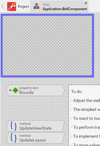
Now, we have to open the empty component we just inserted:
-
Double click on the newly inserted icon
 , representing the bell component.
 -
Inside the composer window, another tab appears which shows the contents of the component class which is now opened:
Filling the component
Next, we have to fill the empty component:
-
First, we do some cleanup: With the Shift key pressed, click on the two methods UpdateViewState and UpdateLayout to select both methods. Press the Del key to delete those methods, we don’t need them for now.
-
Also, click on the note element that contains a lot of text. Press the Del key to delete this element, too.
-
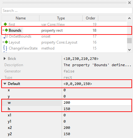
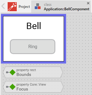
Our component should have a size of 200 × 150 px, so we have to adjust this: click on the property
 Bounds to select the element. Now, in the in the upper member area of the inspector window right to the main composer window you should see the element named Bounds selected. Also note the attributes and properties area below that shows all properties of the currently selected Bounds property.
 -
Inside the attributes and properties area, we can adapt the default bounds values to our needs:
-
Click on the black triangle left to the Default element. Multiple lines will show up which hold the values for the origin (x, y) and the size of the element (width, height).
-
Alter the w instance property of the component to the value 200 to set the default width of the component to 200 px.
-
Alter the h instance property of the component to the value 150 to set the default height of the component to 150 px.
-
In order to adapt the size of the component on the screen, click on the Reload icon
 in the second row of the toolbar or press F7 to reload the class. The blue border of the element will shrink to the new size then.
-
In a further step, we put all the elements onto the element’s canvas:
-
With the gallery templates window left to the main composer window focused (Alt+1), either click on the folder header Views or press key v, this will open and show all items inside the View folder.
-
Click on the item
 Filled Rectangle, and drag an instance over to the component’s canvas. Place the element in the upper left corner of the canvas.
 -
Press F2 to rename the component. In the inspector window, type in Background and press Enter once you are done.
-
Adapt the size of the background rectangle to 200 × 150 px. You may do so by either resizing the element with the mouse or by adjusting the property Bounds in the in the lower attributes and properties area of the inspector window (as described above when setting the default bounds for the component).
-
If needed, adjust the color of the background to the value _#FFFFFFFF (white, opaque).
Now we put a border around the component:
-
In the gallery templates window, click on the item
 Border and drag an instance over to the component’s canvas. Place the element in the upper left corner of the canvas.
 -
Adapt the size of the border to 200 × 150 px. again, this may be done by either resizing the element with the mouse or by adjusting the property Bounds of the component in the lower area of the inspector window.
-
Adjust the color of the border to the value #000000FF (black, opaque) and set the property Width of the border to 1 px.
-
You now should see a black border around your component.
Next we add a header text to the component:
-
In the gallery templates window, click on the item
 Text and drag an instance over to the component’s canvas. Place the element centered in the upper area of the component.
 -
Using F2 key, rename the name to HeadingBell.
-
Inside the attributes and properties area, adapt the newly inserted heading text to your needs:
-
Using the dropdown list, alter the Font property of the text element to the value Resources::FontExtraLarge.
-
Using the dropdown element, alter the Color property of the text element to the value #000000FF (black, opaque).
-
In order to change the display text, alter the String property of the text element to the value "Bell".
-
Since we do have text overflow in the element now, alter the AutoSize property of the text element to the value true.
-
Eventually, we add the core element, a push button that will be used to ring the bell:
-
In the gallery templates window to the left (Alt+1), either click on the folder header Widgets or press key W, this will open and show all items inside the Widgets folder.
-
Click on the Push Button, widget and drag an instance over to the component’s canvas. Place the element in the lower area of the canvas.
-
Press F2 to rename the component. In the inspector window, type in PushButtonBell and press Enter once you are done.
-
Now customize the appearance of the push button. You may do so by setting the property Appearance in the inspector window to WidgetSet::PushButtonSmall and by setting the property Label to Ring.
-
You should now see a push button labelled Ring in the lower area of the canvas.
-
In the search field at the very top of the inspector window, type in Focus to look up the property Focus of your component. By writing the string null into the value input field, set the Default value of this property explicitly to null. An icon
 Focus will appear at the top left corner of the composer window, representing the overridden property. Move this icon to the bottom.
| By setting the Focus to null, we prevent our component from obtaining the focus. Obtaining the focus changes the component’s appearance, which is undesired in our case. |
We are finished now with adding elements to our component, and the component should pretty much like shown in Figure 4 below:
Defining a button action performed on click
So far, we successfully added elements the Bell component. the only interactive element is the push button, so let’s bring life to this component! To do so, we have to add some logic to the component, more specifically some signal handler logic. Embedded Wizard heavily relies on so called slot methods when implementing communication between two objects. Slot methods show the following characteristics:
- Code based implementation
-
Every slot method has a method body containing the logic that will be performed once the slot method was called. The programming language used when authoring code inside the method’s body is Chora:, a relatively unknown, platform independent language which syntax closely resembles C.
- Signal based communication between objects
-
In order to invoke a slot method, a signal has to be send to the method. Once the slot method receives the signal the code in the body of the slot method is executed. Since a slot method does not take parameters, signal-based process communication can happen between all kinds of objects, the sender does not have to know about the identity of the receiver object. However, the identity of the sender is passed onto the slot method in the hidden parameter sender which can be used inside the body of the slot method.
- Inheritance
-
Slot methods are members of class objects. If a class is derived from another class, it inherits all slot methods from this class. As any inherited members, these slot methods can be overridden if needed. You also may call the inherited version ot the slot method by making use of the pseudo method super().
So let’s start and build our first slot method to bring life to our push button:
-
In the gallery templates window to the left (Alt+1), either click on the folder header Chora or press key C, this will open the folder and will present the list of all language elements available in the programming language Chora.
-
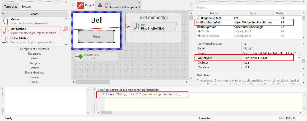
To keep our component organized, it’s a good idea to place a note group on the canvas first:
-
Click on the element
 Annotation Group, and drag an instance over to the component’s canvas. Place the element right to the component’s canvas.
 -
By default, the heading of the note is This is an annotation. Change the heading of the note area by changing the property Caption in the inspector window to Slot method(s).
-
-
By now we are ready to insert our slot method: Click on the element
 Slot Method, and drag an instance over to the component’s canvas. Place the element inside the note rectangle you inserted and adapted in the previous two steps.
 -
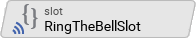
Press F2 to rename the slot method. In the inspector window, type in RingTheBellSlot and press Enter once you are done.
-
Finally, we have to fill the body of the slot method with some code. To do so, double click on the icon
 representing the slot method RingTheBellSlot. In the Code editor, you will now see one single line of Chora code:
sender; /* the method is called from the sender object */For now, change this code line to:
trace "Sorry, the GUI cannot ring the bell!";The trace statement is a debugging command that prints diagnostic output to the log window located in the lower left area of the screen.
We now finished with our slot method now, as soon as a signal will be sent to the method, it will print it’s output to the log window. However, we haven’t connected our slot method to our push button yet, so let’s move on and connect the sender (= push button) with the slot slot method in order to get the push button working!
-
To do so, we have to select the push button first. Select it by either clicking on the button object in the composer area or by clicking on the element titled PushButtonBell, listed in the upper member area of the inspector window to the right.
-
With the push button selected, search for the property OnActivate in the lower area of the inspector window. The property OnActivate refers to a slot method, so as value type in RingTheBellSlot. If you want to save typing, click on the small downwards triangle at the right hand side of the value field select the slot method PushButtonSlot from the long list offered inside the dropdown area.
You are done with your first component, the layout should look like shown in Figure 5 below:
Test the component in isolation
Let’s go and test our first component! There are several ways to do so:
-
From the main menu, select the menu item , or
-
use the keystroke F5, or
-
click on the launch icon
 in the second row of the toolbar.
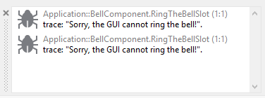
A prototyper window will appear which shows your component and simulate its behaviour: Click on the push button twice, and two debug messages will appear in the log window:
| When we launched the test above, the prototyper acted on a component level, allowing us to test the component in isolation. We do also have the opportunity to launch / prototype the whole application, use Ctrl+F5 to do so. Have a look at Table 1 which summarizes the two different prototyping methods. |
| Prototyping of component | Prototyping of application | |
|---|---|---|
Menu |
||
Keyboard shortcut |
F5 |
Ctrl+F5 |
Toolbar icon |
|
|
Add the component to the application’s root component
Having first component up and ready is pretty cool, isn’t it? Let’s move on and integrate the component into the root component, that’s what the component is made for!
-
Since want to place the component in the Application unit, click on the tab labelled Application. If this tab is not present yet, click on the
Project tab and double click on the Application unit to invoke the tab. Inside the composer window, you should now see the Application root component and the Bell component, developed by you. -
Rename the root application class to TutorialApplication using the F2 key.
-
Double click on the root application class that you just renamed. The root application class will be opened, showing the Hello world! text we added in the last chapter.
-
Using the inspector window, change the Hello world! text to Tutorial application.
-
Using the Bounds property, change the size of the root canvas to 480 × 320 px. If you don’t know how to do that, have a look at how we changed the size of the bell component above.
-
Add a background with the same dimensions of 480 × 320 px to the root canvas. If you don’t know how to do that, have a look at how we added a background to the bell component above. Change the color of the background to Gainsborough (#DCDCDCFF).
|
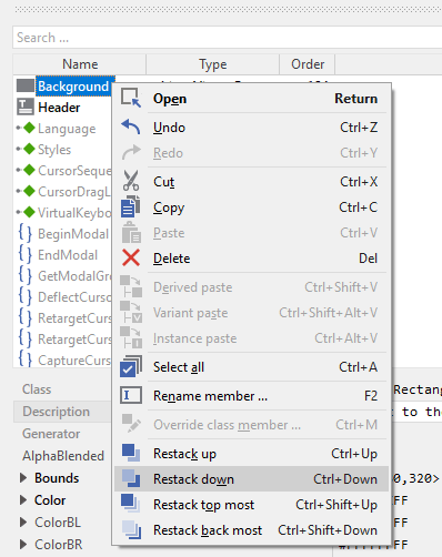
When adding the background onto the canvas, it will be placed in the foreground and will hide your header text. In order to fix that, you have to restack the elements on the canvas.
|
Now we are eventually ready to add our bell component:
-
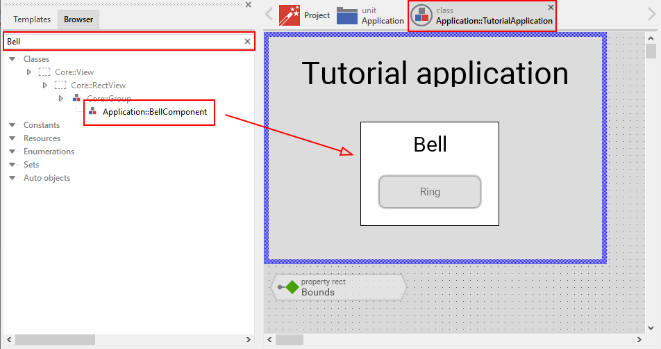
Press Alt+2 to select the gallery browser window, left to the main composer window. Alternatively, you may mouse click at the second tab Browser at the very top of the window.
-
The browser’s list of classes present is quite long, so we have to narrow down the displayed classes: in the search field immediately below the two tabs, type in Bell. While typing have a look at the list and you will notice that the list is getting shorter and shorter. Once you typed in Bell, the only class left is the component newly created by you.
-
Click on the
 Application::BellComponent class and drag an instance of the class over to the root canvas. Place the component below the header text.
Yeah! You successfully included your component into the main app!
Let’s test it out:
-
From the main menu, select the menu item , or
-
use the keystroke combination Ctrl+F5, or
-
click on application launch icon
 in the second row of the toolbar.
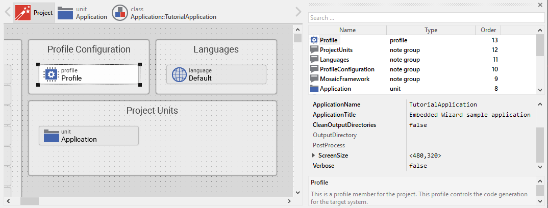
The application will start up. You will notice that the screen size is larger than the root element we put on it. Let’s fix this:
-
Click on the
Project tab (the first tab from the left) and click on the Profile item, located inside the note group Profile configuration. -
Using the inspector window, change the property ScreenSize to <480,320>.
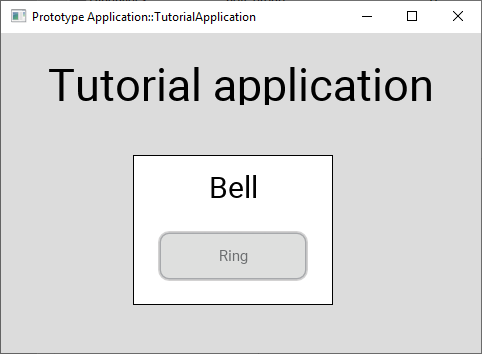
Hooray, it we have our first application up and running:
Let’s move on to the next chapter, there’s still much more to explore!