Getting started with 'Hello world'
For every language, its a good practice to start by printing out Hello World!. So let’s start and do this with Embedded Wizard, too!
Setting up a new project
-
Start up Embedded Wizard Studio
-
From the main menu, select to start a new project
-
A popup appears:
-
In the template, select the item Empty project.
-
Specify EmWiTutorial as project name.
-
For the Location of your project, specify a folder of your choice on your local file system.
-
-
Once project name and location are set, press the button Create new project to bring up the new project.
Structure of the project
Let’s have a look at the structure of the newly created project. As you can see from Figure 1, in total 4 items were added to the main area, the so called composer window:
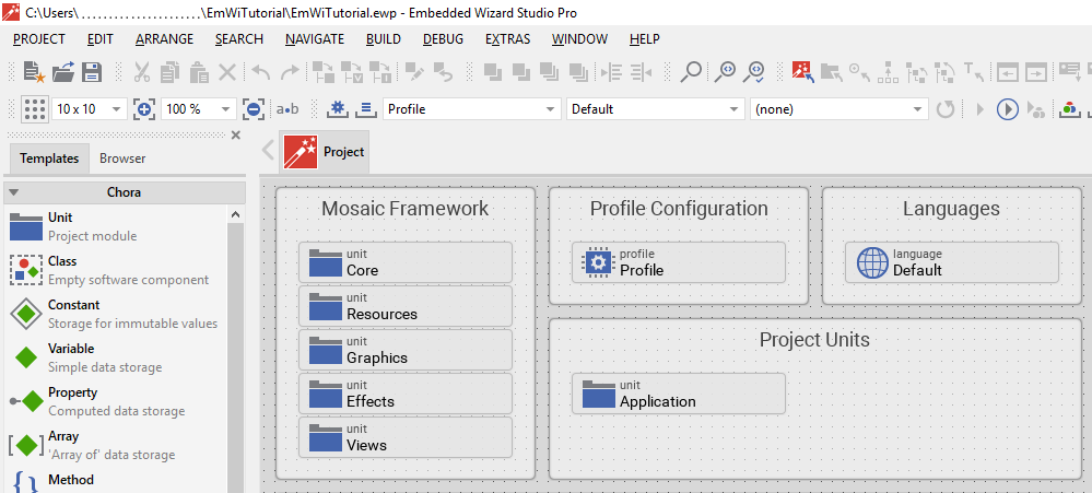
These 4 groups serve totally different purposes:
- Mosaic Framework
-
This is embedded wizard’s GUI framework used under the hood. You shouldn’t be concerned about this right now.
- Profile configuration
-
A profile is used to store configuration parameters for your project. By using different profiles, you can customize the project settings to the different target(s) that you ant to use.
- Languages
-
The concept of languages is deeply embedded into the system’s language Chora. If you want to create a multi-lingual app, you can do so by simply adding more languages here.
- Project units
-
That’s the most interesting part for now, so let’s start explaining the concept behind:
Units
Units are a way to structure your project. For now, we will deal with one unit only, the Application unit. While we use this unit for now, we will add more units later on. Units are a kind of container for our components used, so have a look now what’s inside the Application unit:
-
Double click on the icon
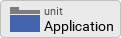 , representing the Application unit.
 -
Inside the composer window, a second tab appears which shows the contents inside the unit which is now opened.
The unit contains one single element only, the Application class:
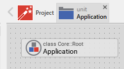
Application class
The Application class is the root element, standing at the very top our application. Again let’s see what’s inside the Application class, which is a kind of container for the elements of the class:
-
Double click on the icon
 , representing the Application class.
 -
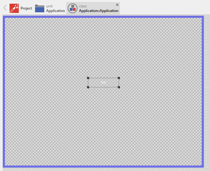
Inside the composer window, a third tab appears which shows the contents of the class which is now opened:
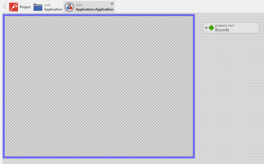
All you will see here is the transparent root canvas, surrounded by a blue border. That’s not much, so let’s put some text on the canvas:
-
In the gallery templates window, left to the main composer window, make sure that the tab Templates is selected.
-
In the main area of the templates window, you will find several text item entries. Click on the item Views, which will open and show all the view-subitems (the items of the templates window follows are arranged in an accordion style layout).
-
Identify the item
 Text, representing a simple text view. Click on the element, drag it over to the root canvas and place it in the middle of the canvas.
 -
If all went fine, you will see a tiny white text element labelled Text in the middle of the canvas.
So far so good, let’s style our text a bit to make it more appealing:
-
In the composer window, click on the newly inserted text view to select the element.
-
Now have a look at the inspector window right to the main composer window: in the upper member area you should see the element named Text selected. Also note the attributes and properties area below that shows all properties of the currently selected text view.
-
Inside the attributes and properties area, we can adapt the newly inserted text view to our needs:
-
Using the dropdown list, alter the Font property of the text element to the value Resources::FontExtraLarge.
-
Using the dropdown element, alter the Color property of the text element to the value #000000FF (black, opaque).
-
In order to change the display text, alter the String property of the text element to the value "Hello, world!".
-
Since we do have text overflow in the element now, alter the AutoSize property of the text element to the value true.
-
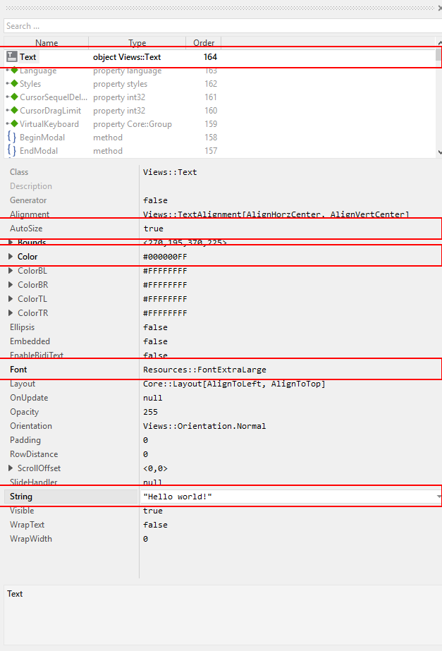
That’s it, we do have our message on the screen now!
| When typing in the Hello, world! text, make sure that the string you typed in is surrounded by double quotes, otherwise an error message will come up. |
Running the application
Our Hello world application is now ready to run!
There are several ways to launch the app:
-
From the main menu, select the menu item , or
-
use the keystroke combination Ctrl+F5, or
-
click on the application launch icon
 in the second row of the toolbar.
Congratulations, you successfully assembled your first application!
Let’s move on to the next chapter, there’s much more to explore here!